About the Project
Web Communications is a complete Digital Marketing Agency that offers digital solutions for businesses of all sizes.
The Challenge
I redesigned a website for a digital agency by identifying user navigation challenges and creating a more intuitive interface.
My Role:
- UX Research
- User Flows
- Sketches
- UI Design & Prototyping
Project Duration: 7 - 15 January 2022
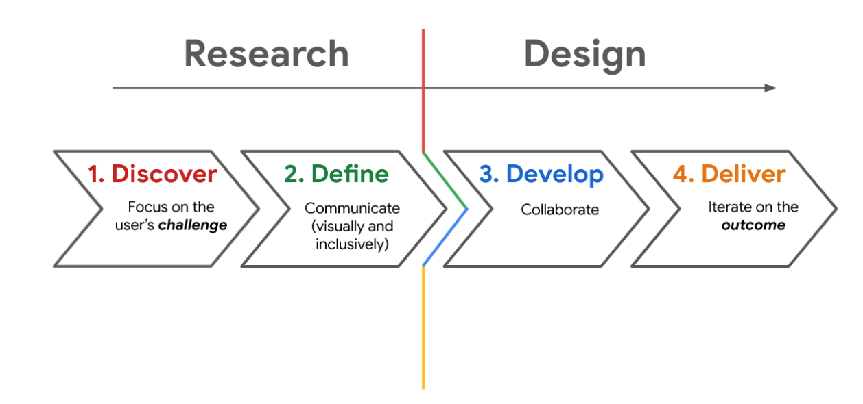
The Design Framework: Double Diamond

This project followed the Double Diamond UX process, which centers around users and their needs. Key stages:
- Discover: Identify user pain points.
- Define: Focus on the primary user problem.
- Develop: Create wireframes and prototypes.
- Deliver: Test and refine the product.
1. Discover the Problem
1.1 Research
Research Goal
To understand the challenges users face when navigating the agency's website.
Research Questions
- What steps do users take while browsing?
- Where do they get stuck?
- Is the website easy to use?
- Is the information sufficient to make a decision?
Key Performance Indicators (KPIs)
Time on task, SUS (System Usability Scale), NPS (Net Promoter Score)
Methodology
- Unmoderated usability study
- Remote (Italy), January 7–8
- 6 participants, 45 minutes each
Participants
- Instagram followers interested in design, aged 25–55 (3M / 3F)
Intro Questions
- What kind of city/town do you live in?
- Are you interested in web design?
- Have you worked with an agency?
- Are you building a site now?
- What kind?
User Tasks & Prompts
- Describe your first impression of the homepage
- Locate the 'Request a Quote' section
- Would you recommend this agency? Why?
- Describe the site in 3 words
SUS Questions
- "I thought the website was easy to use"
- "The design was unnecessarily complex"
- "There was inconsistency in the design"
- "The site felt cumbersome to use"
- "I enjoyed browsing"
- "The design felt a bit messy"
Insights
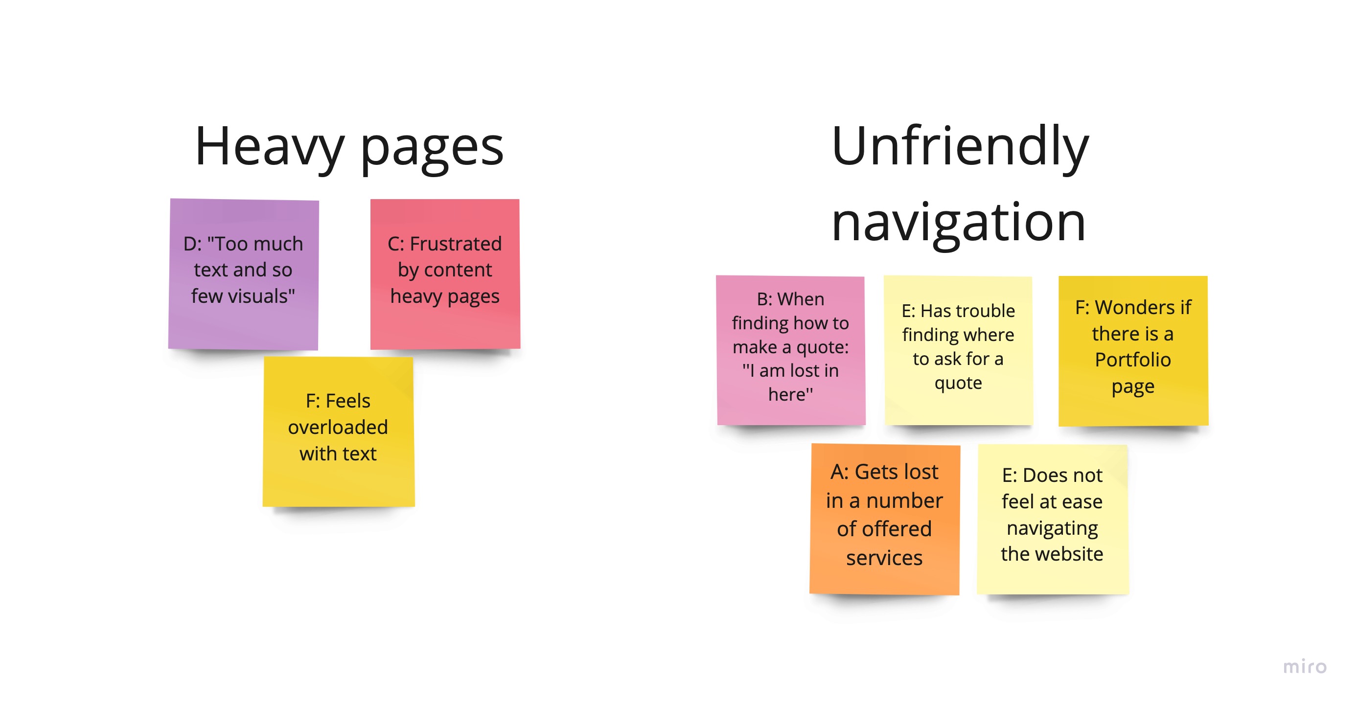
- Users struggled to find the quote form
- Portfolio page lacked visibility
- Information was overwhelming
- Service structure was unclear
2. Define
2.1 Affinity Mapping

3. Develop

What I learned
User-Centric Design: Understanding user needs through research drives better design decisions.
Simplicity: Reducing text and cognitive load enhances usability.
